UX process - case study
About the project
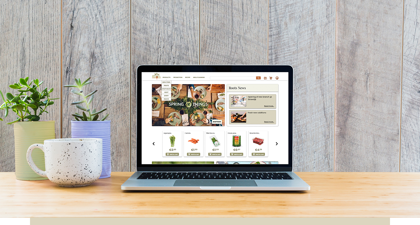
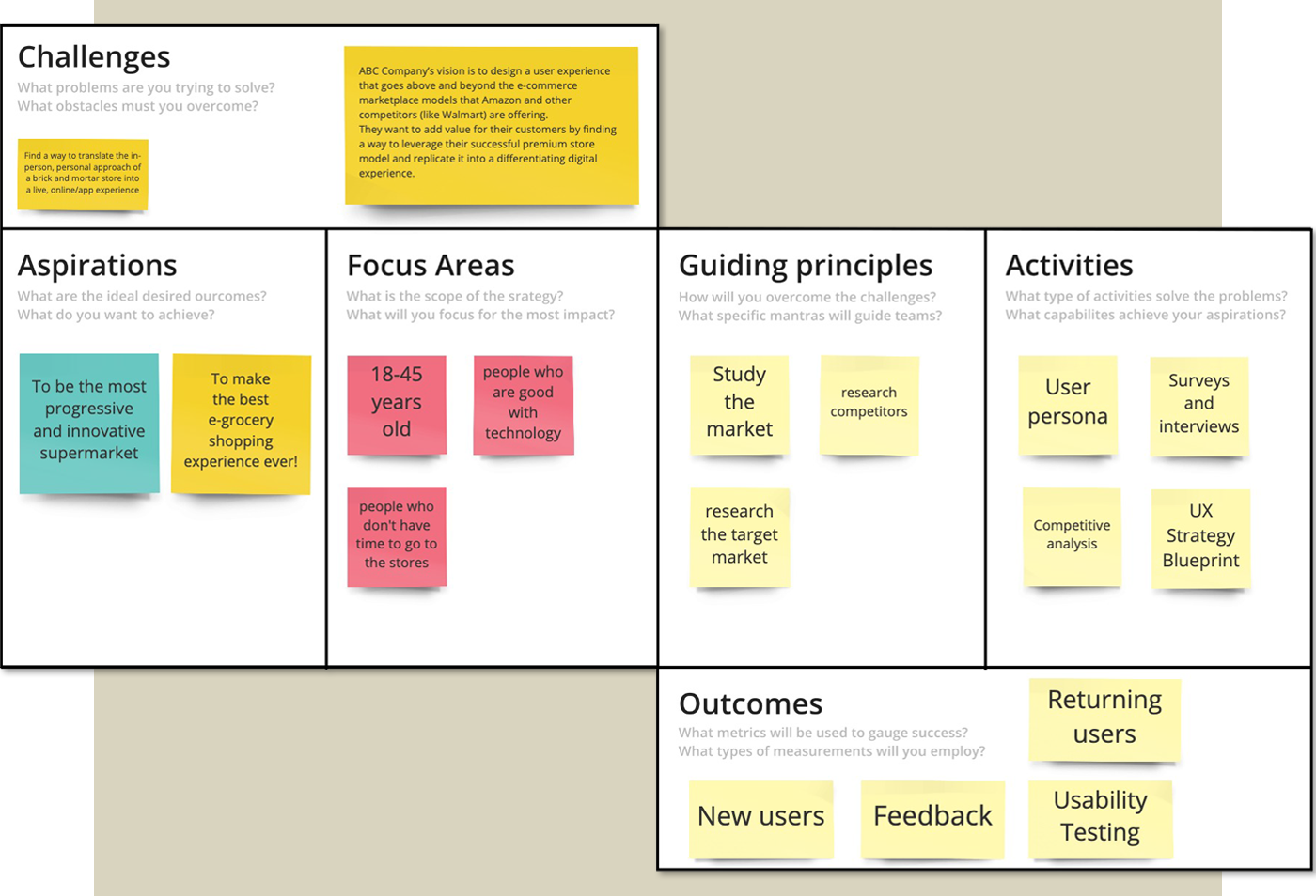
Roots (previously ABC groceries) is a leading regional supermarket focuses on offering high-quality products and a personalized shopping experience. They want to design a user experience that goes above and beyond the e-commerce marketplace models that their competitors are offering.
This project was separated in two parts. First part was the research part. We made analyses, diagrams, personas and got to know the user. After that we did the UI part. We made visual analyses, wireframes, prototypes and finally created a design system for it. We've approached this project according the Design Thinking methodology and took the following steps: empathize > define > ideate > prototype > test

The first step in our design thinking process was to empathize:
We did do a lot of research on what other businesses are doing. Who are their competitors? What are they offering? What are their strengths and what are their weaknesses? What are their strategies and what makes the difference between them? You can see the result in the competitive analyses below.
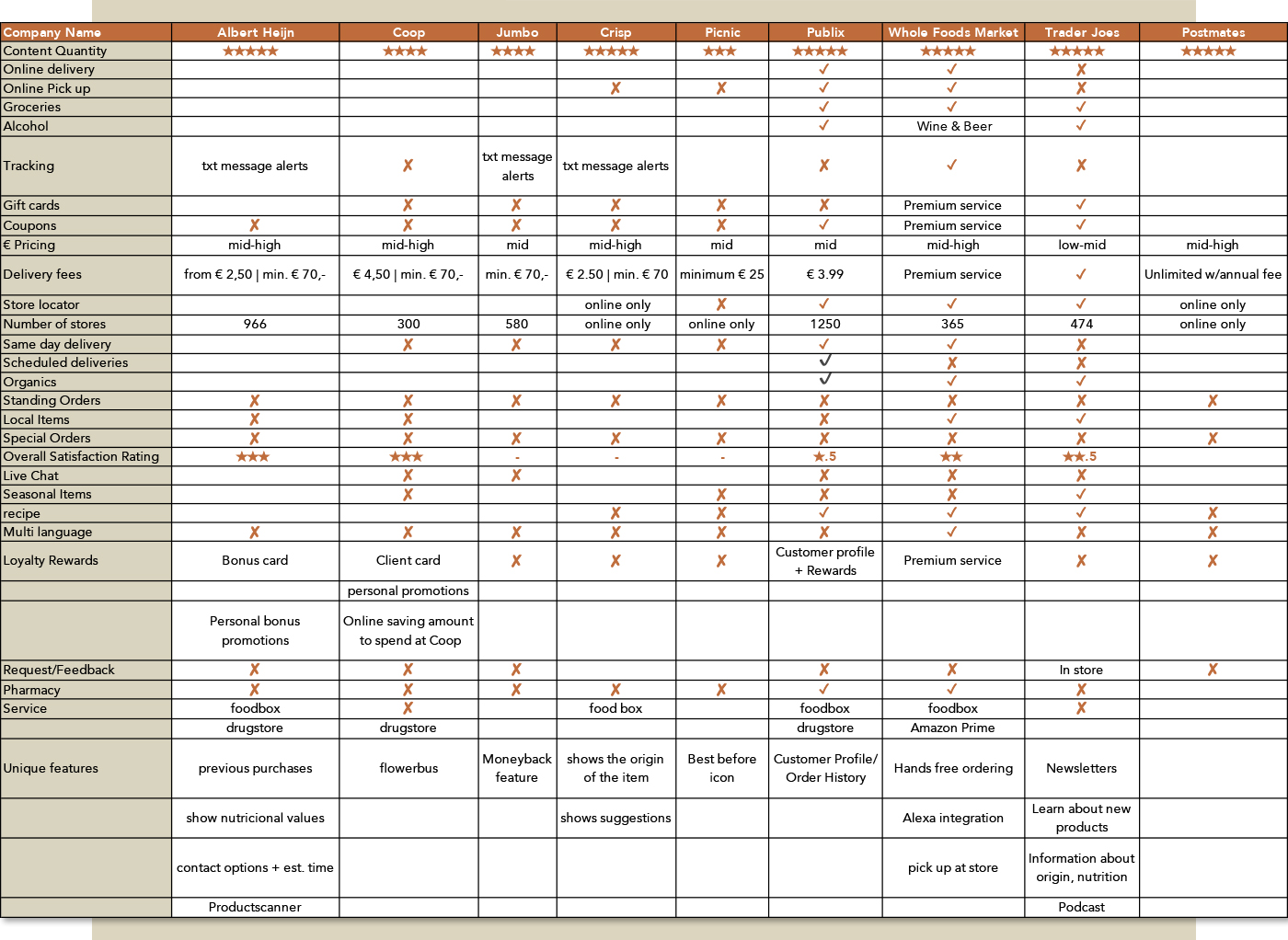
Competative Analyses
After this research we collected our findings and incorporated them into our ux strategy blueprint. This document would guide us through the project and kept us teammembers on the same page. We used Miro so we could all work together on this.
UX Strategy Blueprint
We’ve continued our research by creating a lean survey canvas that helped our team to prepare a powerful survey. We did setup questions that need to answer to fullfill the usereAnd again Miro was the tool that helped us collaborate. We all placed sticky notes and afterwards we discussed and adjusted our findings until we all agreed.
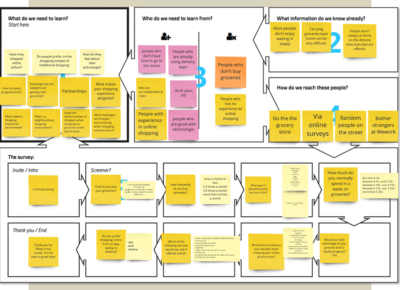
Lean Survey Canvas
Our team worked individually to produce and list the questions and together we setup the final survey to gather data. Besides the online survey we’ve also interviewed about 20 users to get a more qualitative idea of our users needs. On the image below you can
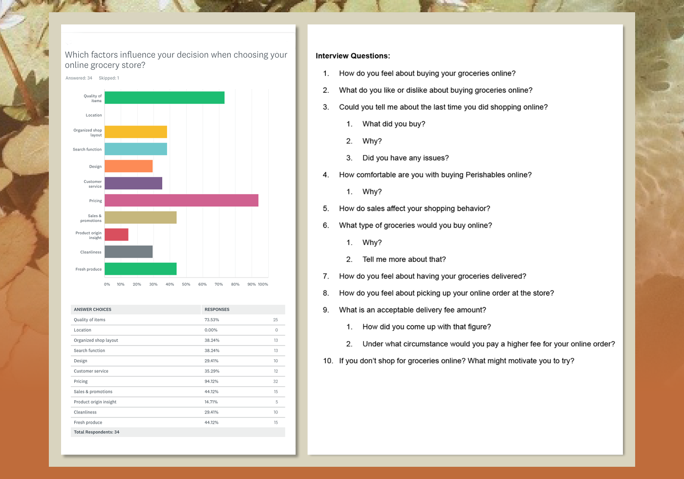
Survey (example outcome of one of the questions) and the list of interview questions (our guidance)
White

In this next stage we’ve started to organize our findings from survey and interviews. We wrote every meaningful insight or answer on a sticky note. After that we’ve placed the stickies on a wall to see which categories were related (see green stickies). We’ve used pink notes for the qualitative and orange/blue for the quantitative data. The results that stood out or were mentioned several times by our team did get a star. These are the painpoints and could bring us to ideas and possible solutions. In the end we’ve found 9 design opportunities. You can see them in the affinity diagram below
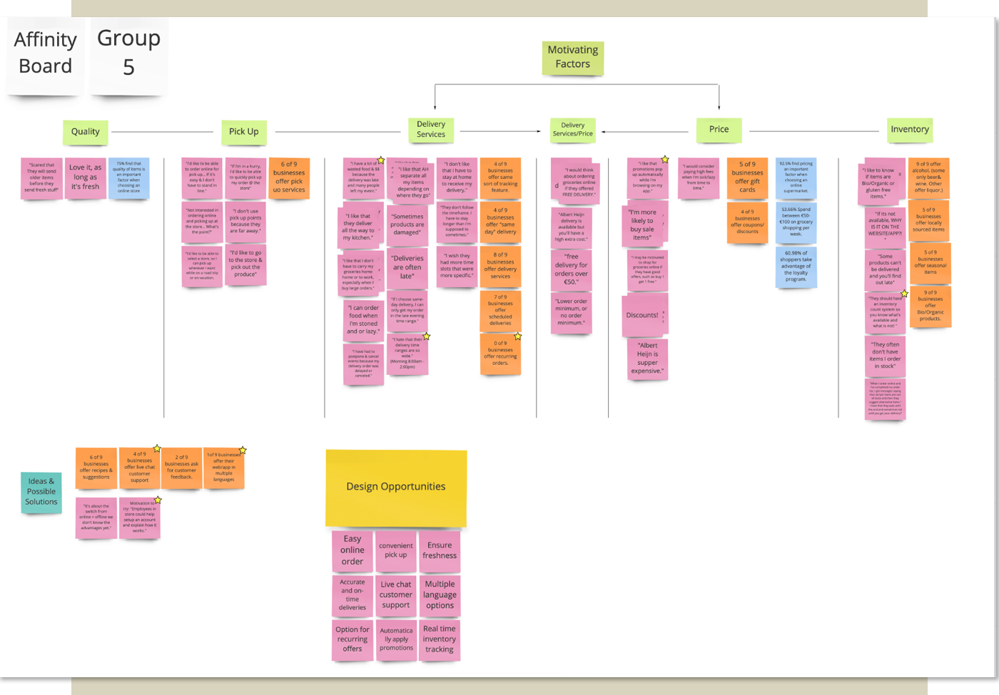
Affinity diagram
The next step in this defining stage is creating our personas. To get an approach from different points of view we’ve worked with Dave and Jane and described their motivations, criteria and frustrations they experience during (online) shopping.
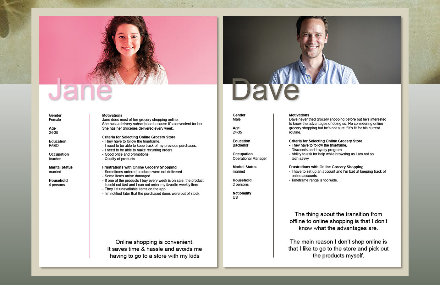
User personas
For Jane we also made a customer journey, to visualize the process she goes through to accomplish her goal. We used this to understand her needs and pain points.
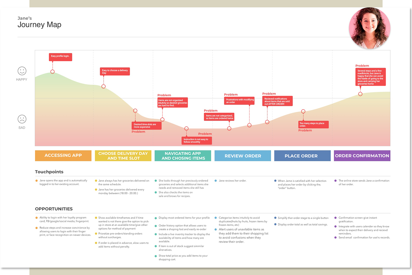
User Journey
Than the mindmapping: Our main problem to solve was to improve the online grocery shopping experience. From there and with use of categories from our affinity diagram we’ve thought of as many problems, challenges and solutions we came across to. This helped us giving insight and bringing us new ideas to our problem. A couple of categories stood out, like quality, inventory and delivery.
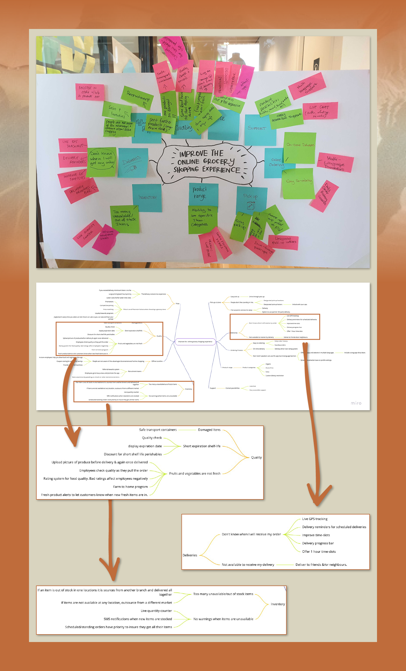
Mindmap > from Sticky notes to Miro
The mindmap gave us a clear insight in the problem statement and the knowledge to define an hypothesis statement.
Problem statement
People don’t trust that all the items they select will be available and delivered
intact & fresh at a date and time that is convenient for them.
intact & fresh at a date and time that is convenient for them.
The result of the problem is that people are hesitant to buy online.
The situation is that people are not using the service to its fullest potential due to the lack of trust not receiving items or receive damaged items.
Opportunity > Increase customer trust that their online groceries will be delivered fresh and undamaged.
People who buy groceries online need reliable deliveries because their quality expectations are not met when groceries arrive damaged or incomplete
Hypothesis statement
We believe that improving packaging for online grocery shopping will achieve more product buying. We know we are right when we see an increase in spending of 5%.
We believe that improving distribution and Inventory insight for online grocery shoppers will increase customer trust/satisfaction. We will know we are right when Customers start ordering more delicate and perishable items.
We believe that giving our customers more freedom with how they want to receive their order] will [motivate them to try the service. We will know this is right when our sales increases by 10%

In this stage we had our problem statement clear and we could start working on the ideation fase. All team members did a a crazy 8 and after that we discussed all our ideas. Then we voted for the best solution by sticking each others best ideas. In our case, a few solutions came out.
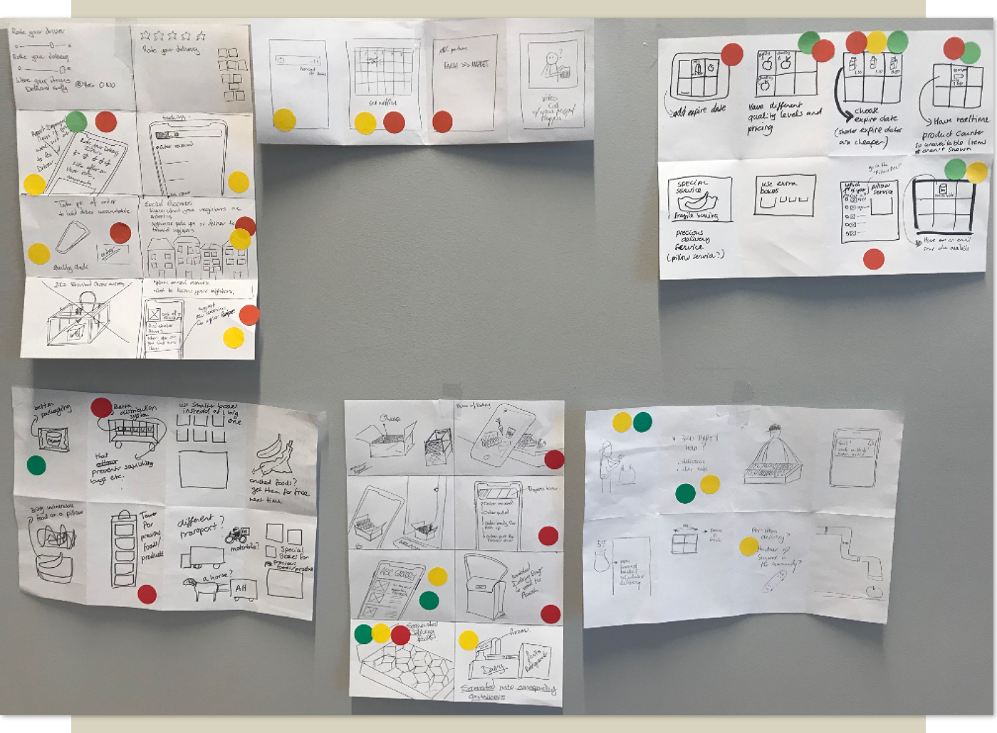
Crazy eight - ideation fase
To determine on which one we would focus we used the moscow method. That pointed us at a few unique features, that were interesting for us to continue with. We combined a few of those ideas and came up with the following feature:
Our feature is that online shoppers can choose a product with a variable price, based on the expire date.
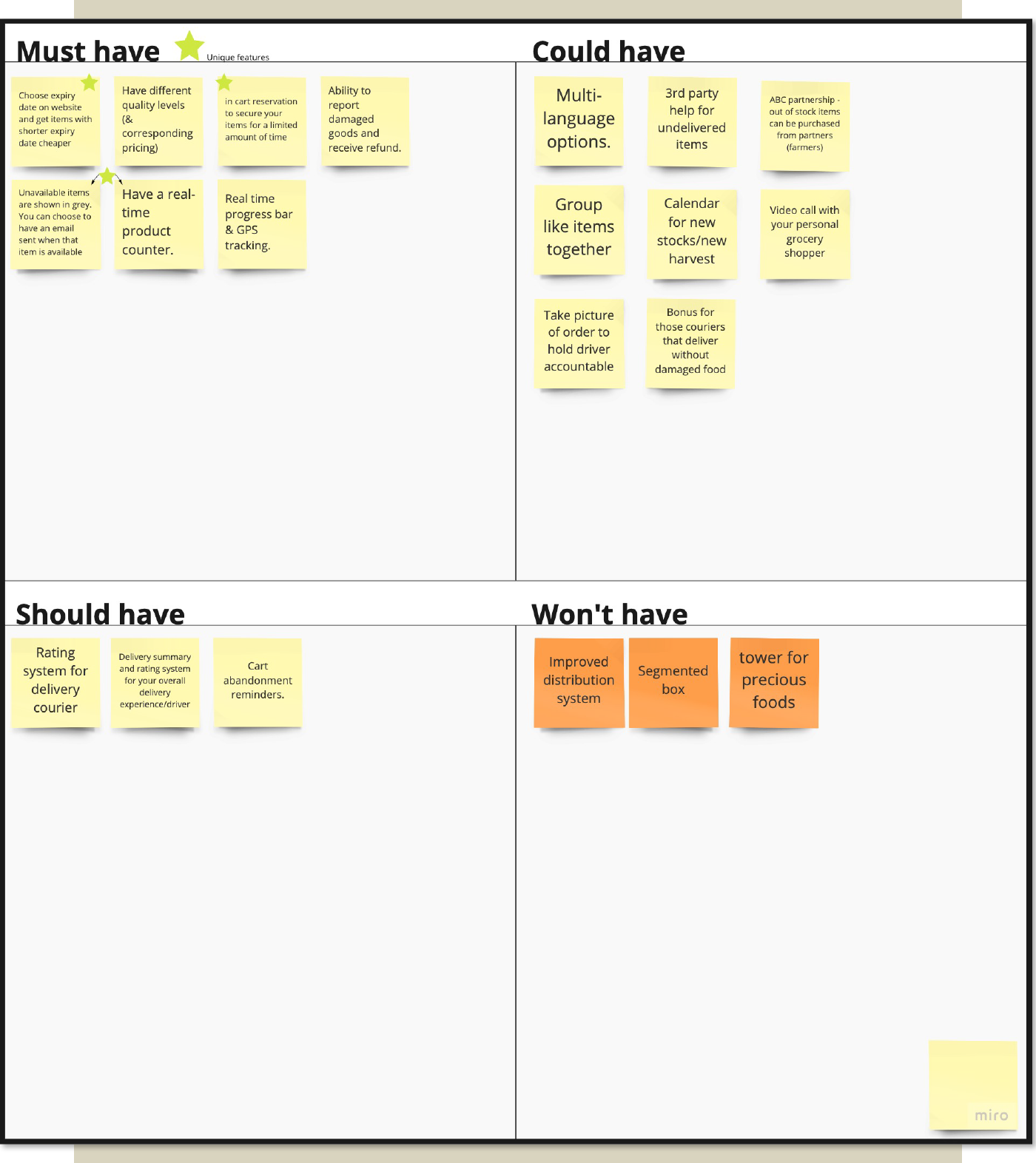
Moscow Method
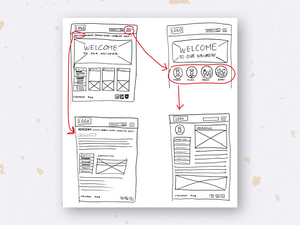
Now we came to the information architecture. We created a sitemap to get an idea of the structure of the website and how the pages relate to each other. As you can see, our new feature was added to our sitemap.
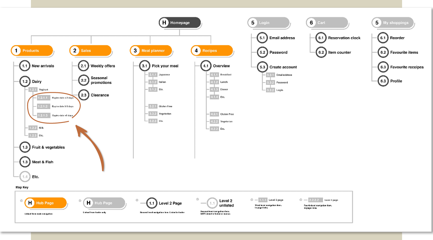
Sitemap homepage Roots
In the user flow below we showed the path that users take to complete a task. We also gave a couple of examples of how our users will interact with our product by showing the ‘happy’ and the ‘unhappy’ pages.
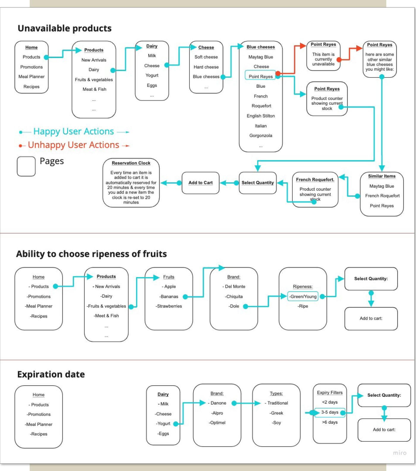
User flow
After finishing the user flow we went on the next part of the project. That was the UI (User Interface) design. This process will be shown here soon.