UI DESIGN - Roots
After we have done step 1-5 in the UX process, we went to the visual part: the user interface and the design system. I take you back to the last step in the previous process (the UX-process).

After doing a lot of research we've gathered a lot of information. The final outcome was that we were going to create a feature, whereby online shoppers can choose a product with a variable price, based on the expire date. So, the closer the expire date, the cheaper the product.
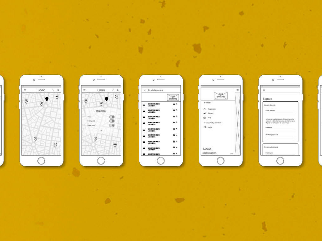
From there we made our first wireframe. A low fidelity version, which we used to test if it works the way we thought it would work. We've asked about 10 people to test our feature. One of the questions was: Purchase yoghurt. Down here you could see what happened with one of our test persons.

Eight out of test persons could buy the yoghurt straight away. One of the persons got there via another direction, but pressed some other buttons first for curiosity. After the testing we went on to prototype the flow to buy yoghurt. It’s still needs mid fi version, to focus on the content and functionality, instead of on the design, which is very basic at this point.
User Interface design
Now the ux part was done it finally was time to work on the visual part. We’ve started of with a visual competitive analysis. What else is out there, what visuals do our competitors use?
As a team we’ve collected visual information. From there we started to look for visuals, photography, logo style and color usage. Because all of us come from a different background and have such a different perspective on the project we taught it was a great idea to use Pinterest for this part of the process. After pinning our individual images, we only kept the ones that all 3 of us liked. So we ended up with the visuals that were democratically chosen.
We made a board for color, photography, logo style, typography and icons and created our styleguide for the visual part. This would be our guide for the design design system we created later. Each one of us did a part of the styleguide and we've discussed our findings a few times a day, to keep eachother up-to-date all of us on the same page. Choosing the right typography and the colors was my responsibility.
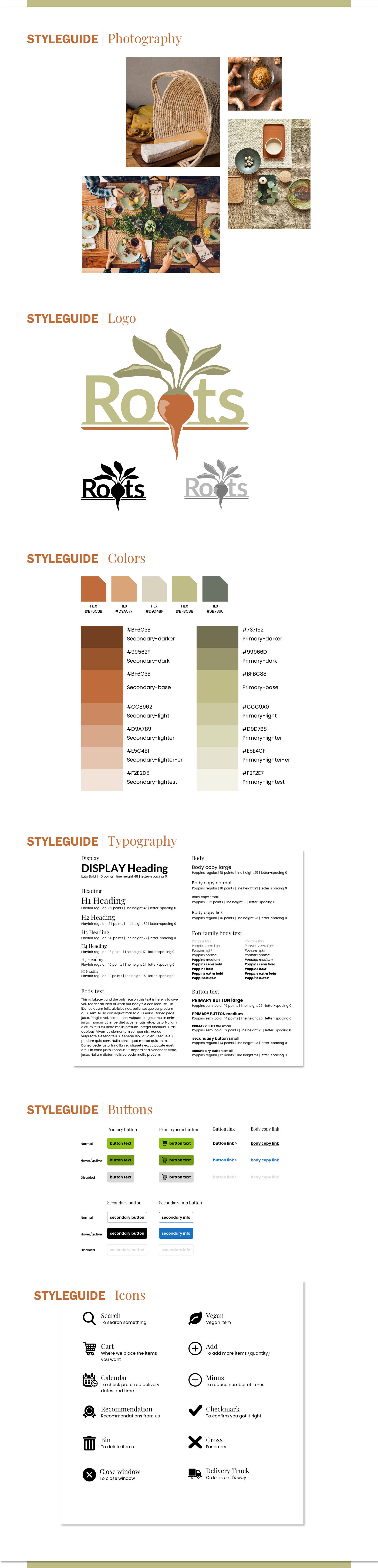
Styleguide for Roots
Design system
For the design system we worked in Sketch. We've divided the basic design elements (top-bar, bottom-bar, buttons, typography, and other ui-elements like cards, carroussel, etc.) so everyone could do some of the work. When those elements where finished we added them to the design system.
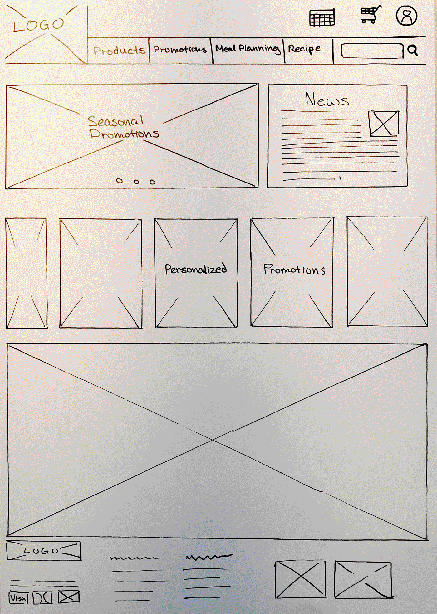
From that point we divided the different pages that needed to be worked on, like the user interface, product page, checkout page, confirmation page etc. and again we could work on it simultaneously. We started every page without images, colors and style elements, just to focus on the architectural structure and flow of the pages. And we tested this version until it was right.
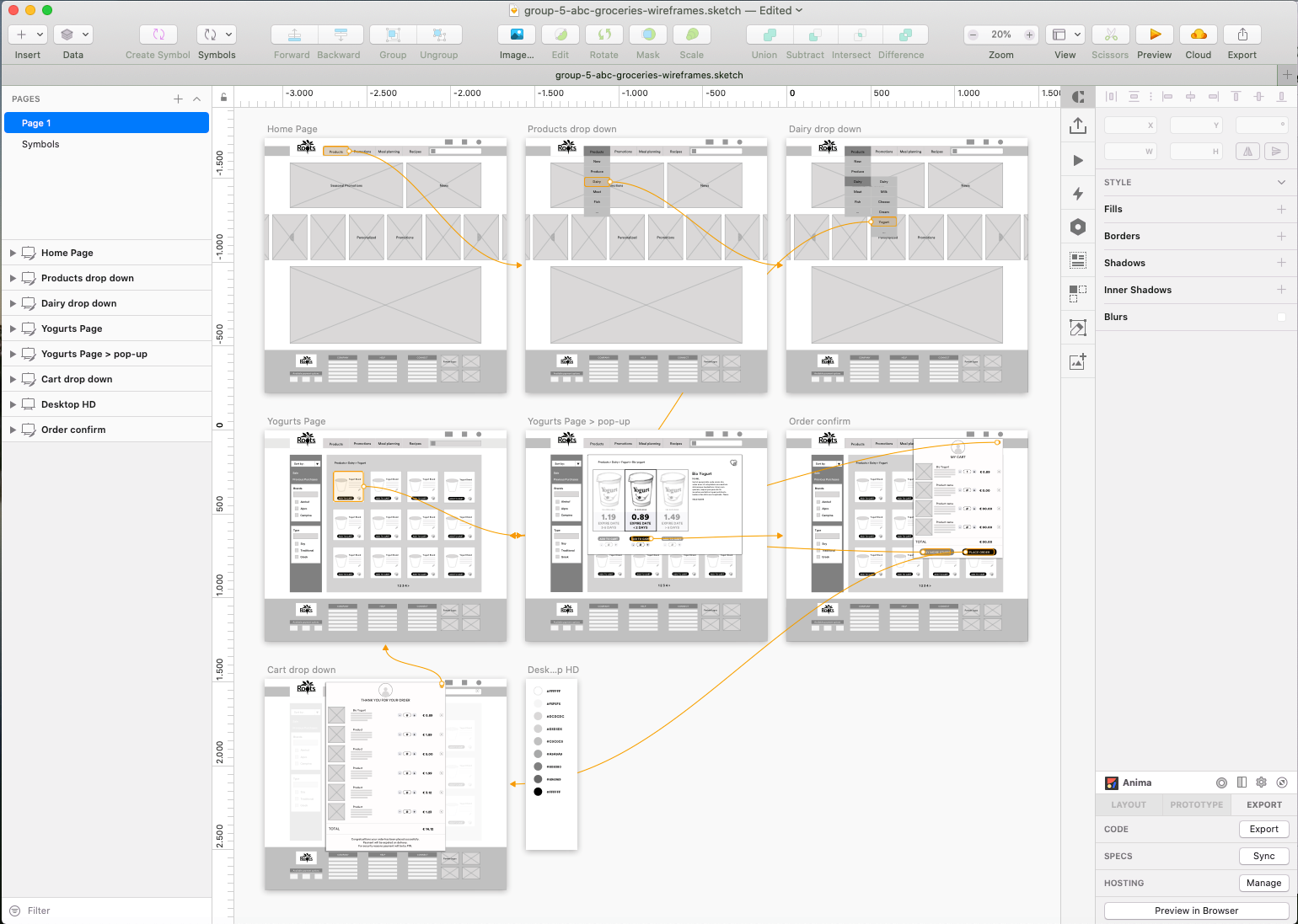
Low-res wireframe
After the test we started to fill the documents in, according to the styleguide we've produced earlier. We've setup the right symbols, colors, typography, photography, icons and other style elements and created symbols in our Sketch design system.
From there we build (part of our) our website, as you can see down below. This prototype could be tested in the next sprint. After finishing the demo we held a presentation. And that was the end of this design sprint.
Demo webflow > purchasing yoghurt
Project Roots (previously ABC groceries)
Team Kriska de Lange, Janick Juin and Dajella Overweg
My role UX designer
Tools Sketch, Principle, Adobe Illustrator, Adobe Photoshop, Miro, Trello,
Method Agile
Duration 2 weeks
Duration 2 weeks